Questionnaire
2-Layout and Content
 This graphs
shows that more than half of the 20 people I asked preferred having a coloured
background on their magazines perhaps to make it more interesting. Some people
would want a normal background so that the articles or page content stands out
more and is more legible.
This graphs
shows that more than half of the 20 people I asked preferred having a coloured
background on their magazines perhaps to make it more interesting. Some people
would want a normal background so that the articles or page content stands out
more and is more legible. 
This chart is where there 20 people are equally divided between the two answers of ‘do you like different headings for each sub-category?’ This is rare due to the audience being random so the answers are hidden.

This shows that the audience prefers lots of detail in there articles so that they are fully informed on what is going on in their favourite music genre.
 People like
to have more pictures across the page so that there is more colour and it is
more interesting to look at, we know this because of the graph.
People like
to have more pictures across the page so that there is more colour and it is
more interesting to look at, we know this because of the graph.
This question
has split the audience between three, the audience mainly prefer having lots of
language devices in there article so that it’s better content to read.
 This graph
shows that most people like the main image of the artist to be framed in the
centre of the page as it is the main piece of content in the article.
This graph
shows that most people like the main image of the artist to be framed in the
centre of the page as it is the main piece of content in the article.  This
question’s favourite answer is a location background so that It can express
more feeling to the article. A block colour was the least favourite background because
it is plain and quite boring to look at when you’re reading.
This
question’s favourite answer is a location background so that It can express
more feeling to the article. A block colour was the least favourite background because
it is plain and quite boring to look at when you’re reading. 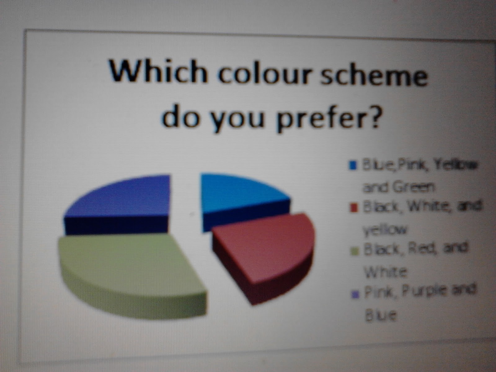
This shows
that all the different colour schemes are split between the audience quite
equally so it show people all have different favourite colours.

Most people
have been shown to prefer having an equal balance of text to image so that it
has information and some pictures relating to the text.
 This shows
that people generally find the larger font easier to read to the fact that it
is larger, and maybe bolder due to this. Also it can look neater in a magazine
to have larger font size.
This shows
that people generally find the larger font easier to read to the fact that it
is larger, and maybe bolder due to this. Also it can look neater in a magazine
to have larger font size.
No comments:
Post a Comment