Mast heads and text colouring

This mood board shows some of the other magazines from my chosen genres, they have a variety of different text colours and styles that have inspired me in what I want to do.


 This graphs
shows that more than half of the 20 people I asked preferred having a coloured
background on their magazines perhaps to make it more interesting. Some people
would want a normal background so that the articles or page content stands out
more and is more legible.
This graphs
shows that more than half of the 20 people I asked preferred having a coloured
background on their magazines perhaps to make it more interesting. Some people
would want a normal background so that the articles or page content stands out
more and is more legible. 

 People like
to have more pictures across the page so that there is more colour and it is
more interesting to look at, we know this because of the graph.
People like
to have more pictures across the page so that there is more colour and it is
more interesting to look at, we know this because of the graph.
 This graph
shows that most people like the main image of the artist to be framed in the
centre of the page as it is the main piece of content in the article.
This graph
shows that most people like the main image of the artist to be framed in the
centre of the page as it is the main piece of content in the article.  This
question’s favourite answer is a location background so that It can express
more feeling to the article. A block colour was the least favourite background because
it is plain and quite boring to look at when you’re reading.
This
question’s favourite answer is a location background so that It can express
more feeling to the article. A block colour was the least favourite background because
it is plain and quite boring to look at when you’re reading. 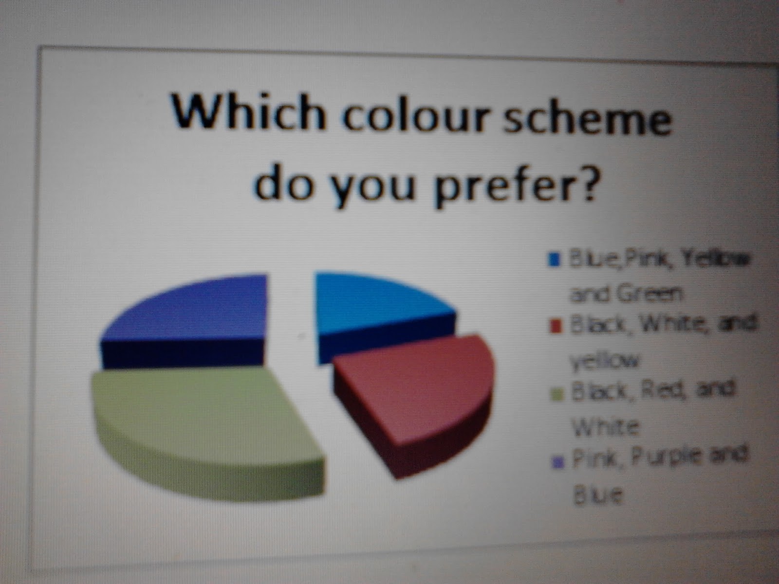

 This shows
that people generally find the larger font easier to read to the fact that it
is larger, and maybe bolder due to this. Also it can look neater in a magazine
to have larger font size.
This shows
that people generally find the larger font easier to read to the fact that it
is larger, and maybe bolder due to this. Also it can look neater in a magazine
to have larger font size. 


 Indie- is a bold style that can be
recognised straight away because it is bright and colourful. The style is unusual
it has dull colours and then bright parts like the ends of the models hair if it’s
a girl like the picture. This genre can produce the connotations that the model
wants to be centre of attention because of the extreme look. There is also
little typography on some of their magazine covers so you can’t analyse a lot.
Indie- is a bold style that can be
recognised straight away because it is bright and colourful. The style is unusual
it has dull colours and then bright parts like the ends of the models hair if it’s
a girl like the picture. This genre can produce the connotations that the model
wants to be centre of attention because of the extreme look. There is also
little typography on some of their magazine covers so you can’t analyse a lot.
 Rock- is a style that involves an actual
band that plays heavy metal music. They may be extreme looking to send out a
message to the audience. They usually wear a lot of black and are surrounded by
black stuff with bold colours like red, blue or white to. This could connotate
that they are unhappy or that there words are meaningful because black is a
dark colour.
Rock- is a style that involves an actual
band that plays heavy metal music. They may be extreme looking to send out a
message to the audience. They usually wear a lot of black and are surrounded by
black stuff with bold colours like red, blue or white to. This could connotate
that they are unhappy or that there words are meaningful because black is a
dark colour.  Pop-is also usually very colourful to go
along with the cheerful music in the genre. The style is often quite childish
with shapes like stars used on the page to brighten it up. This connotates that
the music is happy and will make your day seem better. The artists that are
displayed on the magazines for this genre are all smiling and doing interesting
poses as it looks more interesting like the music. This style is quite similar to indie.
Pop-is also usually very colourful to go
along with the cheerful music in the genre. The style is often quite childish
with shapes like stars used on the page to brighten it up. This connotates that
the music is happy and will make your day seem better. The artists that are
displayed on the magazines for this genre are all smiling and doing interesting
poses as it looks more interesting like the music. This style is quite similar to indie. 
 Dance-
is a bright
funky style because dancing involves lots of excitement and that’s the
connotations the colour gives off. The magazines from this genre often have a
lot going on and a different mixture of colours. The artists portrayed for this
genre are happy and doing dance moves to show what is inside. The target
audience is obvious because of what the magazine is about.
Dance-
is a bright
funky style because dancing involves lots of excitement and that’s the
connotations the colour gives off. The magazines from this genre often have a
lot going on and a different mixture of colours. The artists portrayed for this
genre are happy and doing dance moves to show what is inside. The target
audience is obvious because of what the magazine is about. 

