
Wednesday, 24 April 2013
Double page spread final
For my double page spread very little was changed other than some of the font sizes, the biggest change was the 'Review' sub heading which was made a lot larger so that it stands out more when you first see the page.

Monday, 22 April 2013
contents final

Contents page analysis
For my front cover there was a complete idea change after I had my review from the first idea. For my first idea I had all the different subcategorys on different boxes so you could easily see all the different sections that would be inside. This needs to be changed as the most important subcategory needs to stand out on the page from the rest and this can happen by using a background.
Front Cover changes
This is my finished front cover after the changes suggested from my feedback. I have changed a few pieces to make sure that it looks perfect. One of the changes that I have made is I have added a few pictures of some prizes so that the audience can see more of what is inside on the front cover before they buy it. Another change that I have made is some of the text sizes are different as some parts were not as bold and clear as they needed to be.


I am now happy with my finished front cover editing after I have changed a few bits.
Front cover analysis

The front cover of my magazine is a bright and interesting page, although there are some improvements that can be made. The page needs some extra pictures perhaps of prizes to give it some different colours and more stuff for the audience to look at and so they can see a closer look of whats inside. The Magazine name should be thicker so that it stands out more on the page.
Monday, 4 March 2013
Conclusion
conclusion
overall for my magazine I rate my performance as being successful as I have chosen a target audience with an appropriate size audience and a good age range between the youngest and oldest. I have drawn in a large crowd from making my product because I have made a magazine that fits their needs. I have used the appropriate technologies to the right standard and created a product that will sell when it needs to.
Evaluation Question 7-Preliminary and coursework
Q7. Looking
back at your preliminary task, what do you feel you have learnt in the
progression from it to the full product?
Preliminary task Coursework
Photography skills are weak In the
coursework my picture is
Picture is from a bad angle is
from the perfect angle.
And is not very clear.
Layout of the preliminary task In the coursework
the layout is
Is very immature and has a much
improved and looks better.
Styles used and colours mature because black and white
Don’t match.
Are used.
The content of the preliminary the content is
much more
Task is much less detailed than complex and better
and much has
That more is needed to a better
Quality.
The technology’s that have been The different technologies
have
E.g- Photoshop
as better effects have been used.
Evaluation Question 6-Technologies
Q6. What have you learnt about technologies from the process of constructing this product?
During the process of making my magazine I learnt lots of different skills which can be used in media. One particular skill that I learnt was how to take good pictures and how to get the photography right for my magazine. You need to learn how to choose the right lighting and the appropriate style for the genre music or type of picture you are taking. The picture angle is also essential so that you capsure the right look for the use of the picture taken. The model in the picture needs to look natural and not look like there positioning or facial expression is fake as they will be shown in the media and need to look professional.
In the making of my magazine I also learnt how to use 2 different software’s for editing and helping create each part. For my magazine front cover and contents page I used Photoshop and for the double page spread I used In-Design. For Photoshop I learnt how to use different text layouts and how to edit my picture so that it is perfect. I also learnt how to use everything on there so that I could include good content in my magazine. For In-Design I was able to create a double page spread to go in my magazine, with a ready edited photograph from Photoshop. Learnt how to place backgrounds and again use different features.
Not all of my magazine went well; there were so tricky stages where I thought my cover photo was to dark. For my front cover I have got different coloured strobe lights and the light made because face look unnatural due to the angle that the picture was taken at. With some editing I managed to fix it and dim her face so it was more visible and the overall look is more professional. Also my contents page had some minor problems, I originally had blocks with the different subcategories on but then I decided that it was too much and the colours were to overpowering. So I removed them and was then able to add more information because it looked to bare which took longer than I expected. The double page spread however did not take long for me to complete and had one issue that was I couldnt angle the picture right so that it would look good across a whole A4 page.
Altogether I have learnt quite a lot about all these technologies like they take a lot of time because there is so much coordinating and learning needed to be able to create a faultless piece of work. The colours in your magazine will be changed around so many times so that its equal and it is a long process. The other internet technology that I have learnt a lot about is blogger because before this I have never written a blog or used one of these internet sites so it was a new expirience. I learnt how to use the layout on blogger and make my work presentable. I also learnt how to use some other websites like Prezi a website where you can create your own brainstorm and upload it to other websites and slide share a website used to upload PowerPoint’s and then put them on other websites.
Thursday, 28 February 2013
Evaluation Question 5-Target audience Interview
Q5. How did you attract/address your audience? INTERVIEW QUESTION’S
What attracted you to SMASH magazine?
When I first saw this magazine I was attracted to the bright and interesting colour scheme and front cover design. I felt this magazine was unique because of how well the cover style fits the genre. The bright colours have been cleverly matched to fit the party lights in the model image which creates the real party feeling. The text is bold and right to the top of the page so it will be seen when hidden behind other magazine which is how I got attracted to it especially because it is yellow with the purple outline to make it bolder. I was also attracted to the bold WIN section because it is purple with white text which makes it clear to read and stand out. The cover is different to others so when it’s in the shop it will be noticeable.
The content on the front cover shows all the best pages, articles and their numbers so that they can be easily found; this is because they are the best pages in the magazine. The sizes of the font also increase in proportion to how important each cover line is the main is largest as it goes along with the picture. The colour of each of these cover lines are different so that there equally spread around the page. This ensures that my magazine has a neat and professional look so people are attracted to and will want to buy it in the shop.
The contents page of my magazine has followed the same colour scheme as my front cover, purple and green, which are slightly different to most magazines due to they have a different scheme inside. The text styles and fonts are all the same as my front cover so that the whole magazine is in the same size with important parts enlarged. The content of it is into more detail, each cover line is now written down whereas on the front there are only the best ones. They have also got a brief description so that the audience can see what the articles are about which is important so that the audience gets an idea of what they will be reading.
The contents of this page are lots of catchy cover lines so that the audience wants to read everything and find out the latest news on their favourite artists. My target audience liked how I had has explanations for each cover line because it allowed them to see if it was to their interests before they read too far into the article. The content of this is much like other magazines because I know they were successful so my magazine will be to.
The target audience thought that my double page spread looked very professional and the colour scheme works very well together, this is because I have used a simple black and then the bright green and blue. To match the image to the colour scheme the green and blue were carefully selected from the image so that it creates a special finish.
The contents of the double page spread are the most important out of the whole magazine due to it being the part the audience spend the most time reading. My target audience said that my article was enjoyable to read and had some English language devices like an ellipsis to leave the audience thinking about what they have just read.
Monday, 25 February 2013
Friday, 15 February 2013
Evaluation Question 2. Script
SCRIPT
Q2. How
does your media product represent particular social groups?
How do the photographs and text represent men and women?
The photographs in this magazine would represent older people because clubbing and partying at nightclubs is something that you tend to do from 18+. Also the atmosphere shown in the front cover photograph might not be the type of party everyone likes. The text in this magazine represents young/middle age people because the words used are simple and content would interest them because it is quite a basic and an overview of an upcoming artist.
None of the above terms are
represented in my magazine because I wanted to create a diverse feeling and
style to my magazine, the only one represented is the fact that all of my
artists that I have chosen are white.
The genre of my magazine is Dance and party music; I have represented it well by having the bright green and purple lights to represent a clubbing atmosphere and using Beka as my artist because her image fits my genre.
Certain people in my magazine have been displayed specially as they are upcoming good artists or are the most well-known. Some of them have been displayed in a larger font or have their picture next to them for example.
Thursday, 31 January 2013
Introduction to Evaluation
I have now finished creating my Front cover, Contents page and Double page spread for my magazine "Smash". My magazine is aimed at the dance and party genre and is for both males and females starting from 16 to around 25. I choose this genre because it is an interesting style and I thought I could be creative with how I made it, e.g-lighting. To help me get a general idea for how I should start and get inspired I did 5 textual analysis' for a Front cover, Contents page and Double page spread of some current different genre magazines to help me decide which one to choose.
Conducting this research also helped me understand what features I need to include in my magazine which was useful because I could see different styles and very different colour schemes. Throughout conducting this research my designs have changed a lot as you can see from my draft ideas previously in the blog.
I am happy with the end results for my magazine but I think there could be some slight adjustments that would make it better. I now am going to do a further evaluation including 7 questions so I can see what went right and wrong.
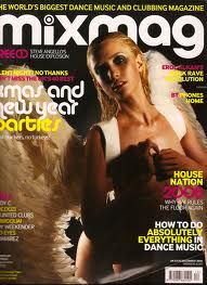
Double page spread inspirations

This double page spread from Mix Mag which is a dance magazine, inspired me to create mine because I like the way it looks simple and you can see the artist as you are reading there interview. I changed the layout of the spread so that the artist is on the left hand side of the page and made the background black so that it is slightly different.
Feedback 4- Jill's Review
Front cover
The front cover is good as it has the 2 colour effect which is effective to create a multi sex audience.
Feedback 3- Beka's Review
Front cover
"I think that the overall look of the page fits well with the dance genre because of the setting in the picture, I also like the way the picture matches the colour scheme""Some of the cover lines could be bigger to show that some stories are more important but otherwise I like this page"
Contents page
"For this page I also like the way the colour scheme is carried on but I think you could introduce some more colours so that it does not look to plain"
"I think some of the images on this page could be bigger and some of the text smaller to make it just right"
Double page spread
"For this page it is my favorite because I think the black background and white text looks different and interesting, I also think that using the florescent blue and green makes the page look even better"
"I think the way that some of Beka's actual quotes are highlighted because it makes sure the reader sees the important parts"
Feedback 2-Amy's Review
Front cover
"I agree with Megan that one of the colours for the front cover and contents page colour scheme could be brighter so that it is not to bland""I also feel that the main cover line could be made bigger as it is the most important thing on the page"
Contents page
"I think it would look better if there was less writing or it was made smaller because it looks very compact and like there is to much""I think the pictures work well especially for the prizes but i think that part of the page could be made smaller to allow space for the important things"
Double page spread
"The double page spread could have more text over the image as there is not a lot going on""It also could also have another colour so the overall look is more interesting, only something subtle as the other colours are extreme"
Feedback 1-Megan's Review
Front cover
"I think the colour scheme could have a more florescent colour in it so the page looks brighter, I like how the colour scheme links in to the contents page it makes the magazine look more organised""Some of the front cover cover lines could be a bit bigger so that you can tell which ones are more important and the best stories"
"The image could be slightly more edited so that the models face is brighter"
Contents page
"The contents page could be better organised on the page so that all the text lines up, also some of the text could be smaller so that it fits better""The colours on the contents page could be organised better and not just randomly placed so that the magazine looks more stylish"
Double page spread
"The double page spread could have another colour added to it, so that it is not to plain"
"The quotations could be smaller in text size so that they aren't the only thing the reader looks at"
Double page spread written article
Beka white
is an upcoming new music artist who has recently released a new album called
vibes. This promising artist is rising fast in the dance style music charts and
is sure to be a face well recognized in the future. She is a happy entertaining
act that is enjoyable to watch for everyone. The young singer first started her
career in singing at school and college where she took any chance she could to be
in the spotlight. Since then she has developed into more public showings and
then to her point in time now where she is noticed by a much wider audience.
Finally, to sum up this wonderful singers start she told interviewers today that this year, 2013, she plans to release a number one single which will be her break through and what she said will be her real start into her busy career.
She has been working on her new album
throughout 2012 and says that she is proud to have finally released it although
it was later than she wanted. She quotes on the cover of her album “Taking the
stage.. Feeling the vibes” which has been a like quotation by many fans. She
says it is how she sums up the experience she has when she sings and performs to
her fans and it is also where she got her inspiration for her album name. Lots
of fans have reviewed the album and name and the comments are all very positive
about it. So far Beka says that her album has been a big success and we will
defiantly see more very soon. The album contains her best hit “vibes” which is
starting to rise in the charts.
This
upcoming artist is proving popular among adults not just teens, some reviews
from people are “sophisticated music style, the words have a meaning” showing
people feel beka’s words. Beka says that she is thrilled that her music has
become appealing to a wider audience because she can get her message across to
more people. She said that she puts a message into her music to create a
different feeling to her music compared to most average stuff.
This artist
has not always had the luck on her side she said, before her career first
lifted off she was only working in a bar and was not living the dream that she
wanted. It was only when she started doing pub singing nights that people
discovered her well hidden talent. Soon after this move she continued to
progress with her wishes and finally produced vibes in late 2012.
Finally, to sum up this wonderful singers start she told interviewers today that this year, 2013, she plans to release a number one single which will be her break through and what she said will be her real start into her busy career.
Thursday, 24 January 2013
Double page spread before changes
This is my double page spread before I have had feedback for it and before i have made any changes.
Double page spread screen grabs
For my Double page spread i have used different colours and styles, I used black, green and blue because the colours stand out together.
The headline on this page has 2 parts two it..


The page numbers at the bottom are white so they stand out because the page is mainly black.

For the first paragraph on the right hand page I have used a large letter to start the text off, this makes the first sentence have more of an effect on the reader.

Throughout the text there are comments from Beka written in different fonts and colours so that those parts stand out better and there is also a review section on the page.


The headline on this page has 2 parts two it..

Along the top of the first page there is a quotation coming from the artist so you straight away know what the article is going to be based on.


For the first paragraph on the right hand page I have used a large letter to start the text off, this makes the first sentence have more of an effect on the reader.

Throughout the text there are comments from Beka written in different fonts and colours so that those parts stand out better and there is also a review section on the page.


inspiring similar magazines: Cover and Contents
When I started to create my magazine front cover, contents and double page spread I chose another magazine that I was inspired by, of the same genre, to use as a sort of template for my design. I then made my pages similar to the these so that I know my magazine will fit in with the genre it is supposed to.

 Mixmag was an inspirational magazine for me due to it relating to my genre and it also has the same sort of colour scheme due to it using black and white and then the two colours.

contents page before changes

Contents page screen grabs
For the title of my contents page I decided to replicate the front cover font so that you can see a clear colour scheme throughout the magazine. I also did the same for a smaller subheading on the contents page.

 As you can see the text is the same and both the words are underlined by the purple thick line. It took me a while to choose the pictures for my contents page because I couldn't make them the right sizes.


For the text on my contents page i changed my design a few times, first all of it was mounted on boxes so that it looked bolder but then i changed it so only one subcategory was mounted on a box so it stands out.


You can see that the text on the purple box is the most bold and stands out more on the page. At the bottom of the page in the quiz sub-category there are some pictures of prizes to be won in my magazine.

Monday, 21 January 2013
Contents page photo shoot
These images are from the second photo shoot that I did for my contents page, there are some mistakes in some of the pictures so not all of them got used in my page.


The image above is slightly blurred so it cant be used.


The image above is slightly blurred so it cant be used.


Feedback for Front cover
Feedback
Some feedback that I got from asking people what they thought of my magazines first copy was..
That my front cover could have some other smaller images so that there is more colour and it looks more interesting. Some suggestions were that I could advertise a prize on the cover that can be won inside the magazine. This would also attract more audience.
Another improvement that I could make is to change some of the text colouring around so you can read it better against the background image.
Lastly a few people suggested that i could change the font to Gill sans ultra bold all over instead of Rockwell because it is a more interesting font.
Overall, only minimal changes need to be made to my cover so that the audience will like it and so that it is clearer.


Front cover-Font and colours
Font choices.
For the title of my front cover i did not choose a special font to stand out i just made the text design interesting by creating a different coloured outline. For my first idea i used 2 different font to choose, Gill sans extra bold and Rockwell extra bold. I also tried using the fonts with a variety of colours to see how they would look.
My final choice was to put the two colours together and use Rockwell extra bold for the title and gill sans for the rest of the text. As you can see my title is slightly behind the artist so that it looks more 3D and looks like she is coming off of the page. The colours that i used on my front cover in the end were black, white, purple and yellow.

Tuesday, 15 January 2013
Chosen Colour scheme
Chosen colour scheme
The colour scheme that I ended up choosing was purple, green, black, white and yellow because it has he two base colours black and white which i can use to create gradients with later on in the magazine.I choose my colour scheme based on my front cover image because it has got purple and green strobe lighting which i thought looked good and would be a nice idea.

As you can see from the photograph it has created a interesting background, this is now easy for me to make a background for my contents page because you can see the basic colours.
Photo shoot 1- Front cover images
The images on this blog are the pictures from the first Photo shoot before i have edited them. You can see how some of them have some faults to them that would effect there use in my magazine. Some of them have got different artificial lights so that the atmosphere is more like a disco/club night.
The final front cover image that i choose a few times due to lighting problems and the style of the picture did not fit my cover the first time. Due to my changing picture it meant that my color scheme changes a few times to. The image above has not been edited yet so has got to much green light but I edited it to fix this. I choose this picture because people said that it looked more natural than others because the artist is slightly to one side. Some of he pictures are good but cannot be used due to blinking or there to dark.


Subscribe to:
Comments (Atom)